Portfolio redesign with agentic AI
I designed my portfolio as a product, then built it with a team of AI agents.
- Design direction
- Agentic AI
- Interaction design
- Accessibility
- 5agent team working in tandem
- 48hours from zero to launch
- 7,000+lines of code
01 · The brief
A portfolio that is a product.
My old portfolio read like an online CV and didn't showcase my product design talent. I wanted the new one to be the centrepiece of my experience: an idea taken from 0 to 1, built using what I know about agentic AI.
I wanted my portfolio to be a product, not just a website. It's a little meta, but designing a product to showcase my product design skills felt like the perfect use of the medium.
I also wanted to put my agentic AI knowledge to work, and direct a team of agents the way I'd lead any design and development team.
My old portfolio read like an online CV.
A portfolio designed as a product, built with agents.
02 · Style directions
Picking the story to tell.
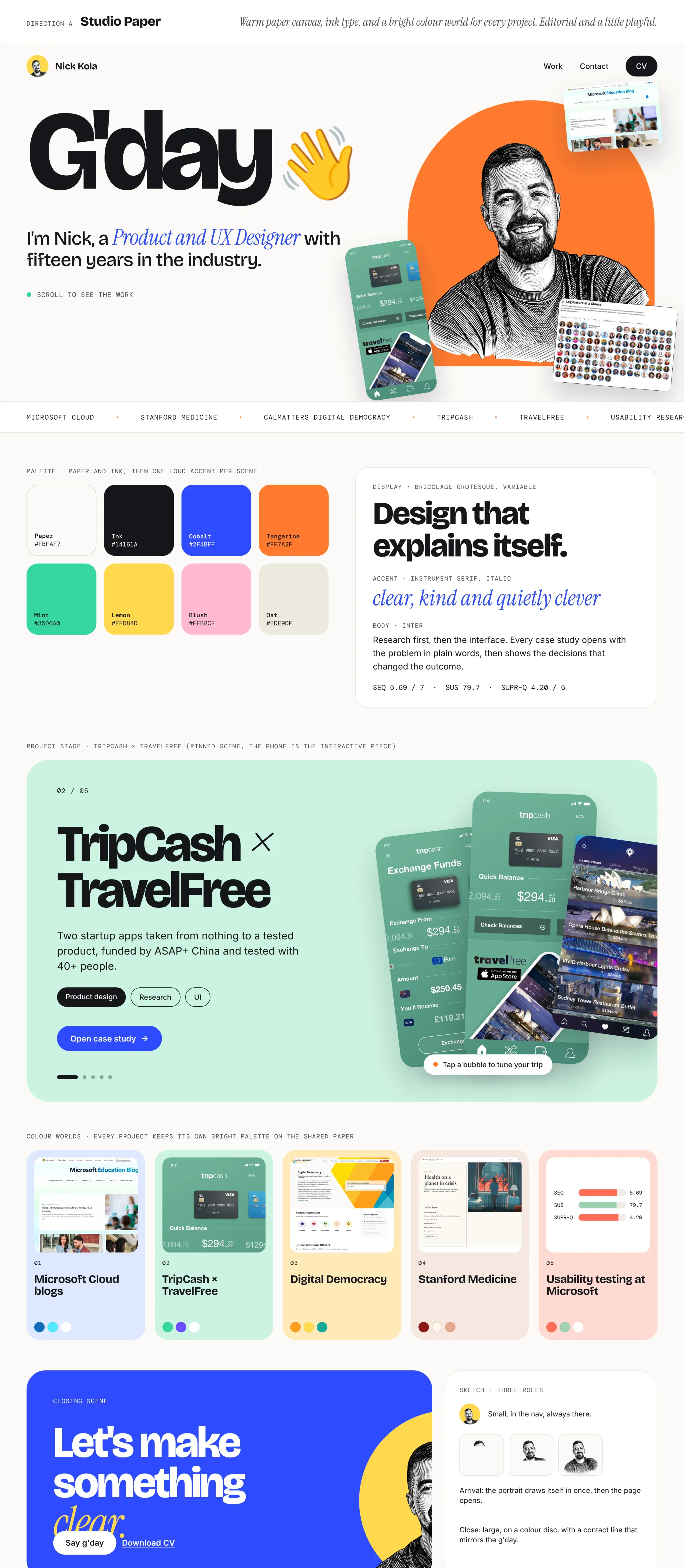
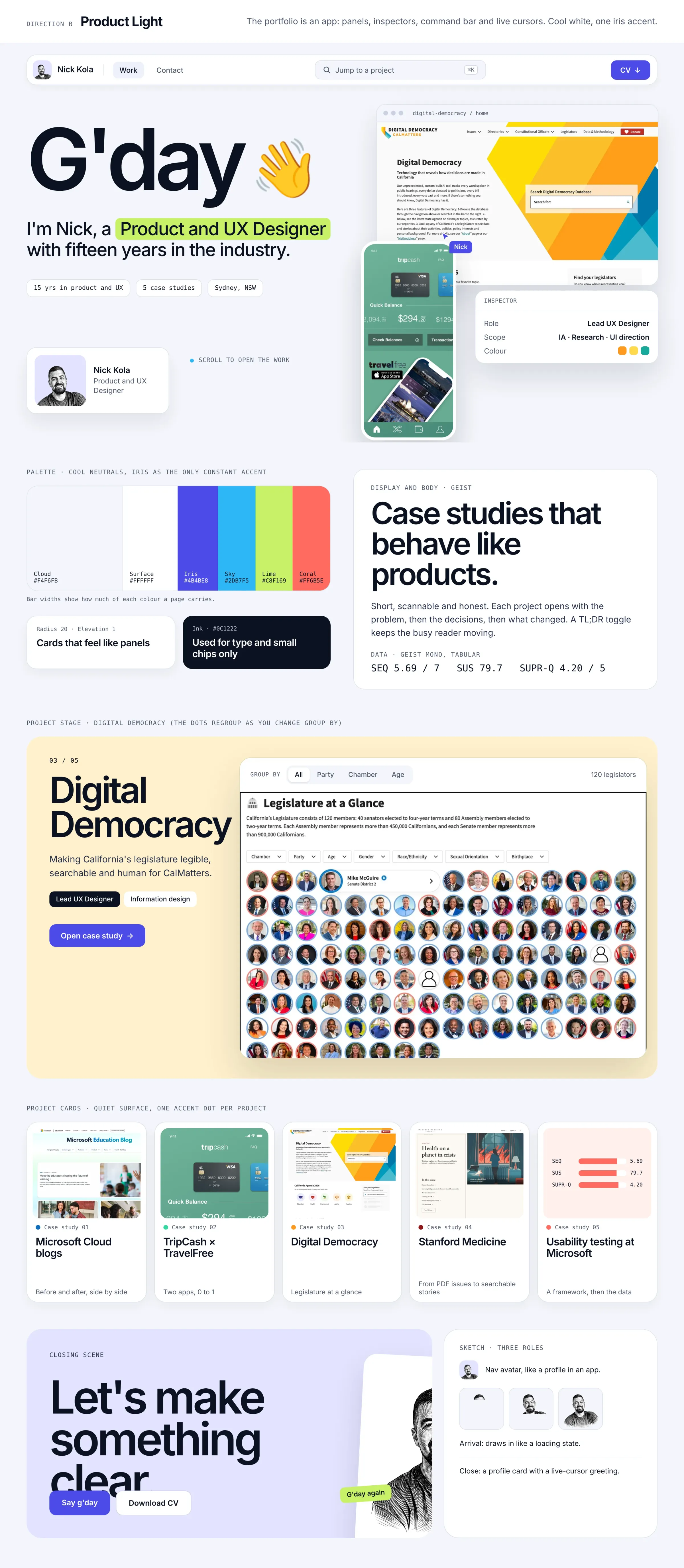
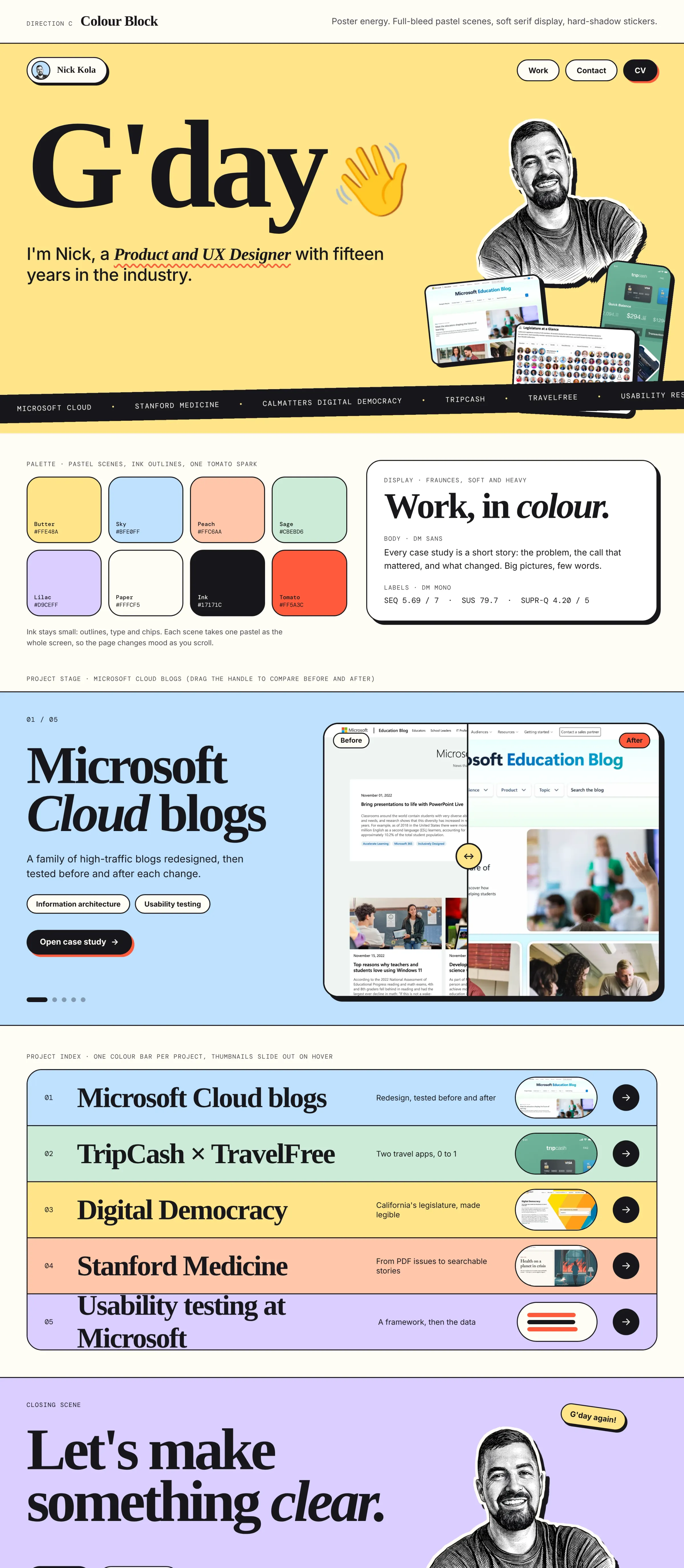
I explored three light directions as style tiles: Studio Paper, Product Light and Colour Block. Studio Paper told the story I wanted to tell, through the use of colour and the project stage.
I wanted the experience to cover two distinct ideas: deliver my work as efficiently and effectively as possible, and flex my product design muscles while doing it. Studio Paper met both.
03 · The concept
Navigating a product, not a website.
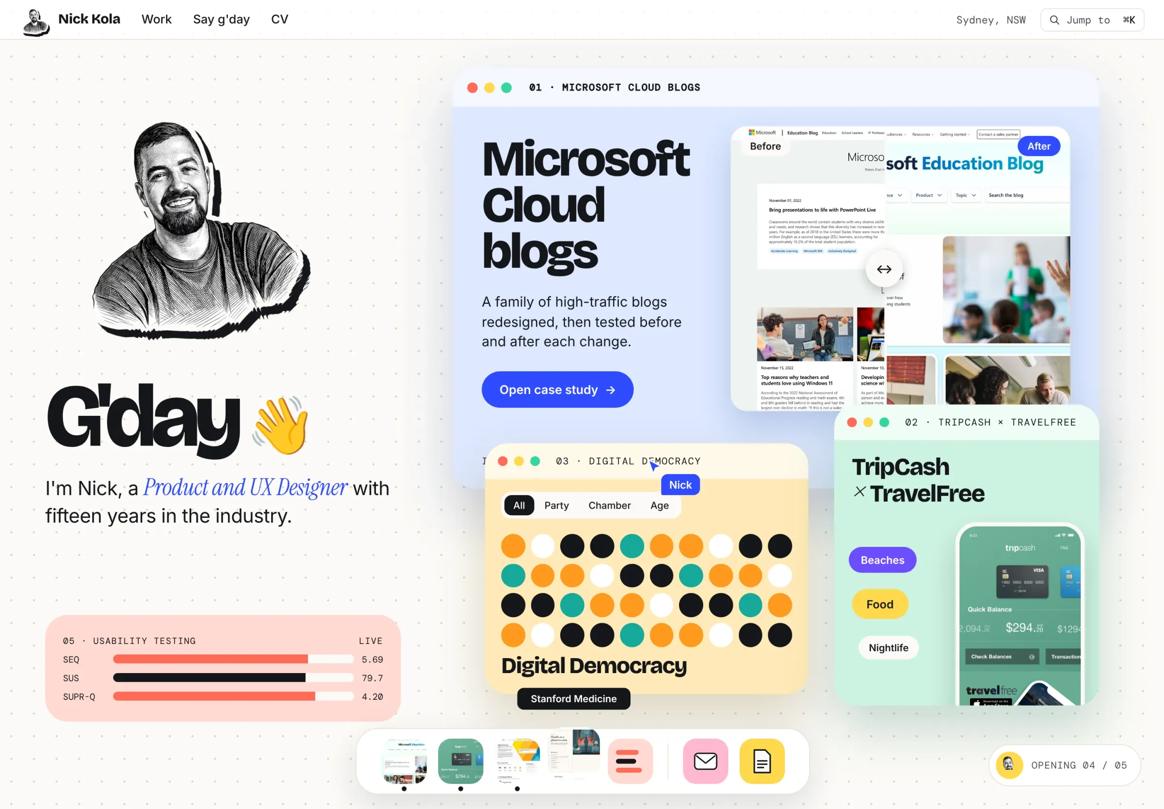
The feedback that moved the design forward the most was simple: I wanted it to feel like a GUI. I wanted people to feel like they were navigating a product, not a website.
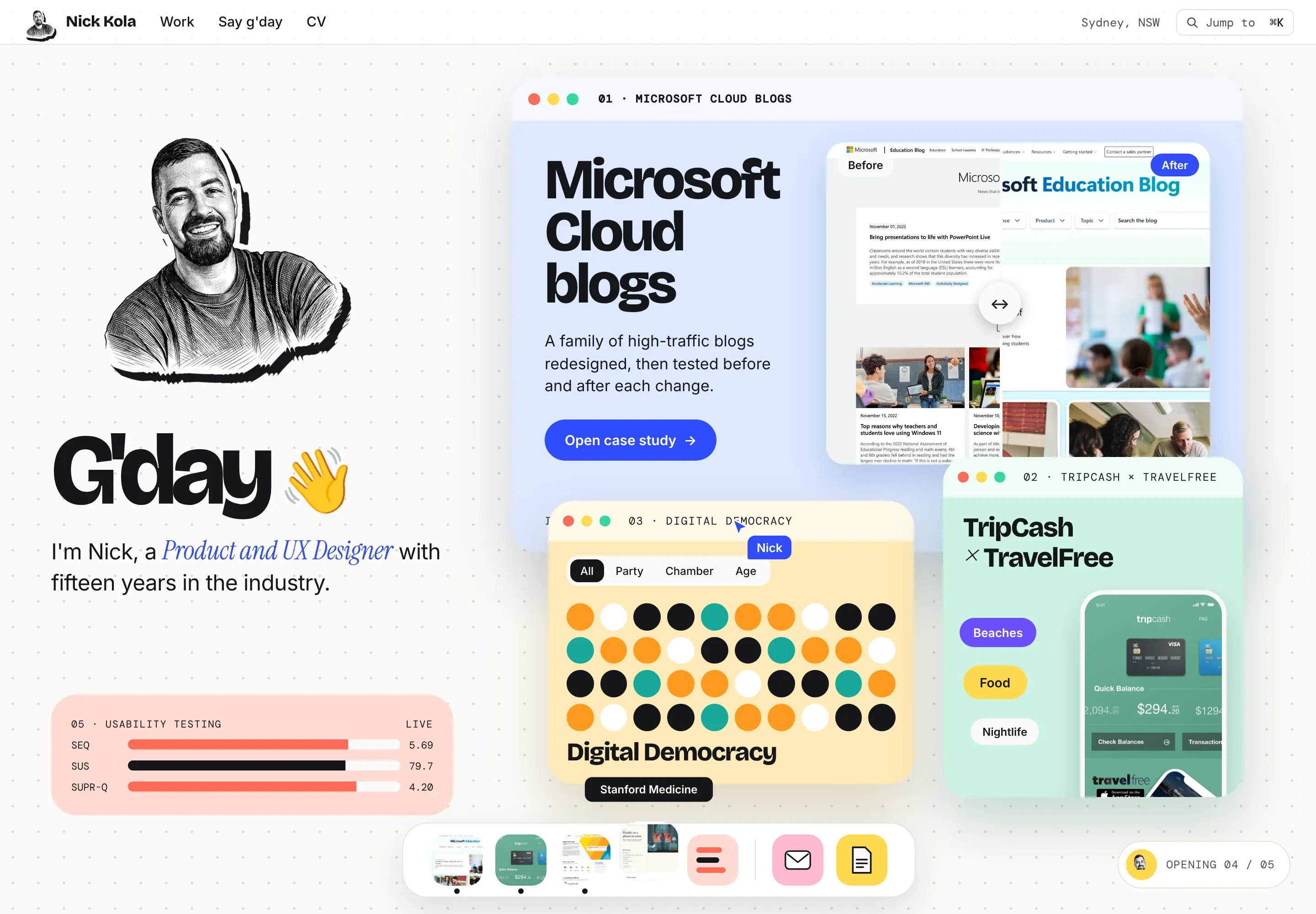
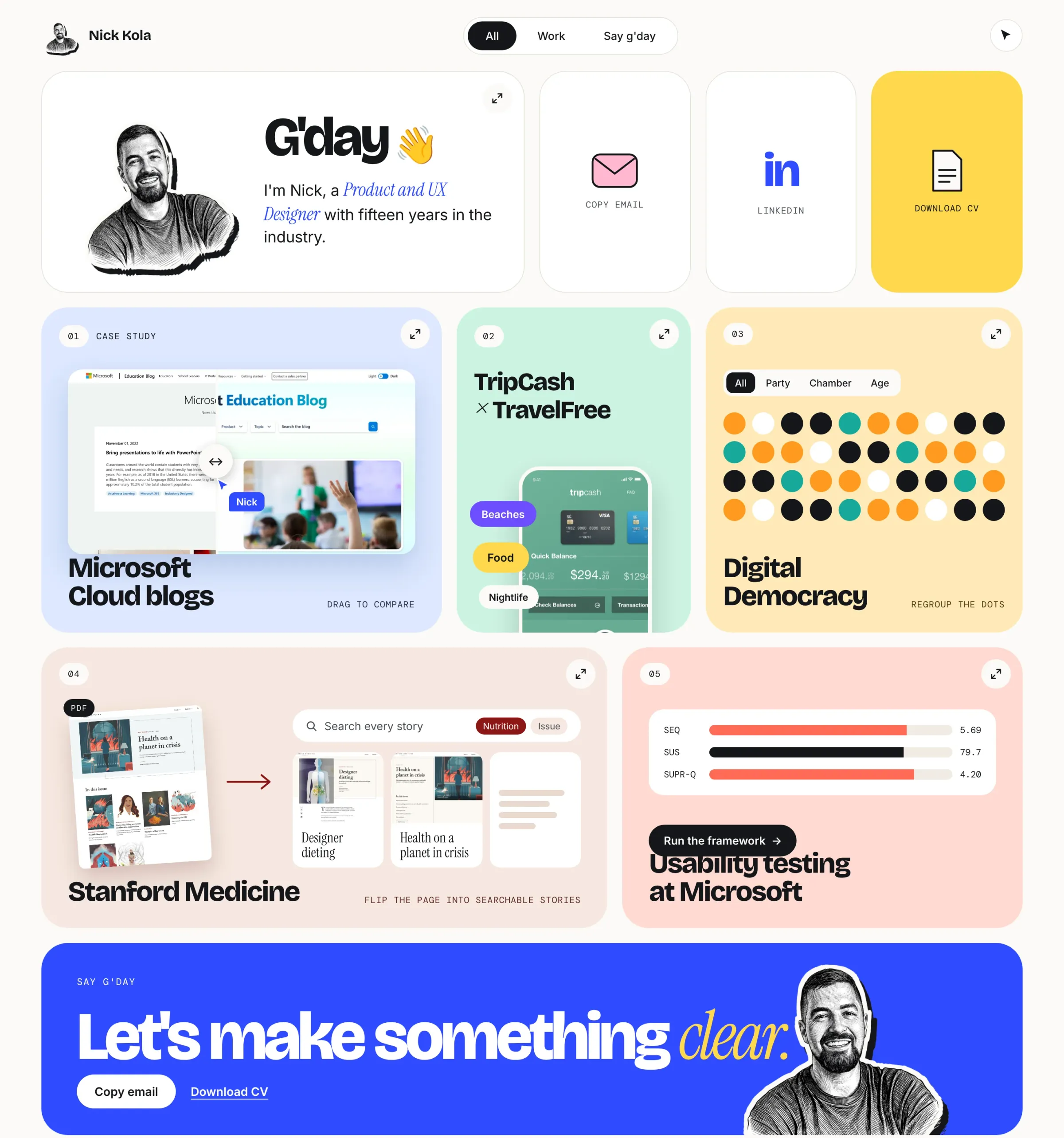
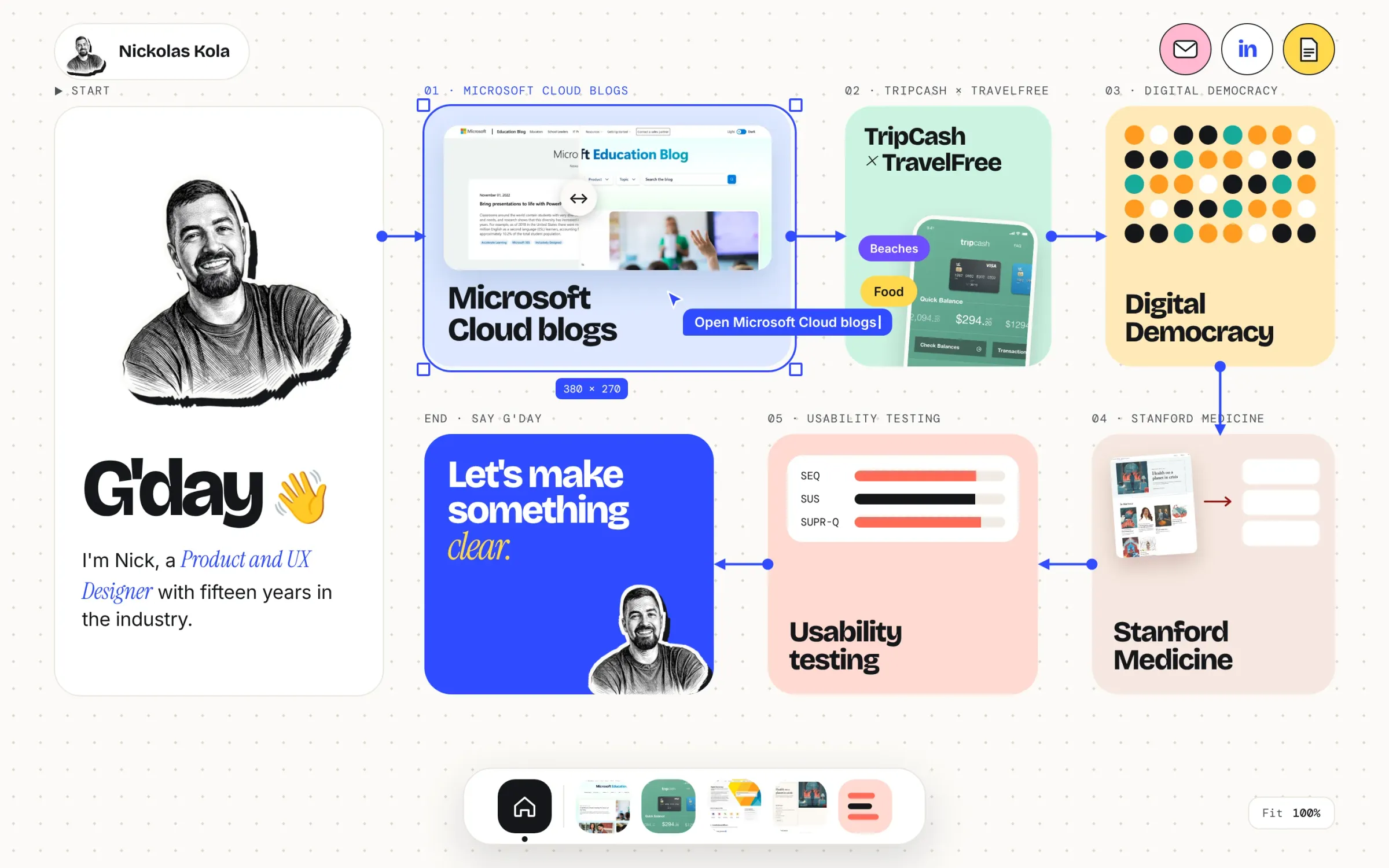
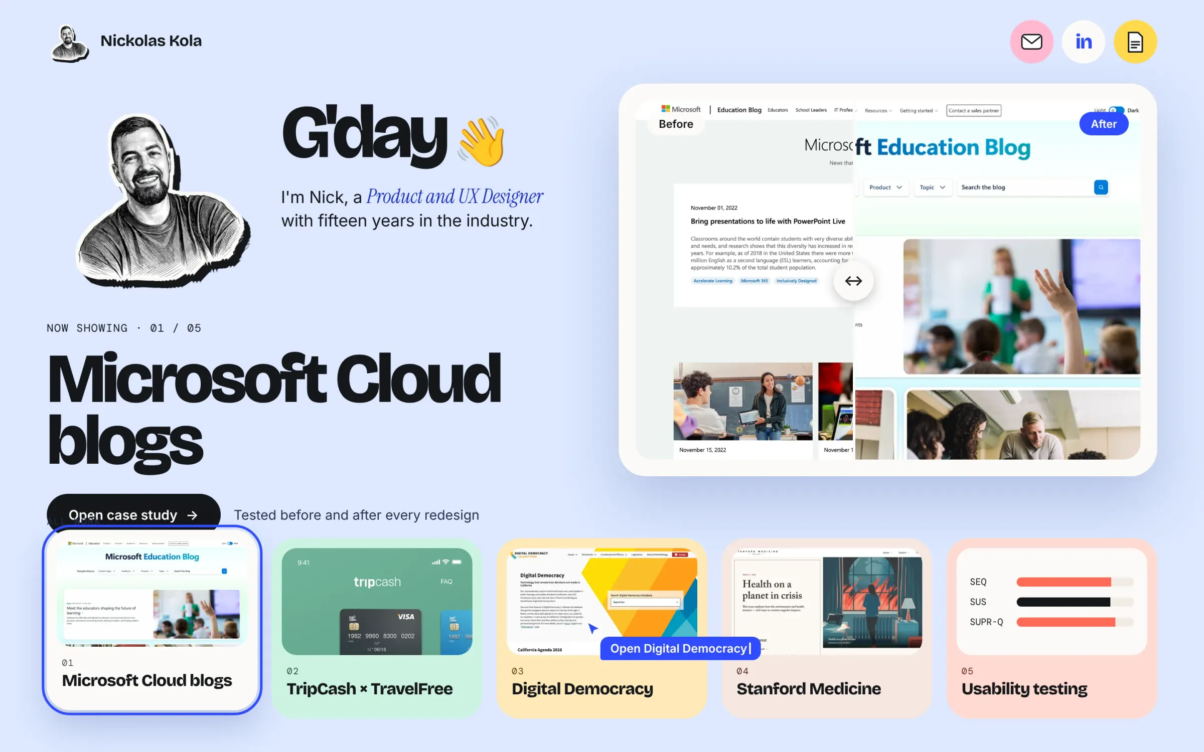
So I tried four homepage concepts: a widget board, a desktop, a project flow, and a stage and shelf. The widget board is the one I took forward, a launchpad you open apps from.
From there Home became the launchpad, and every other page became an app with its own menu bar to get around.
04 · Design to live
From design to live.
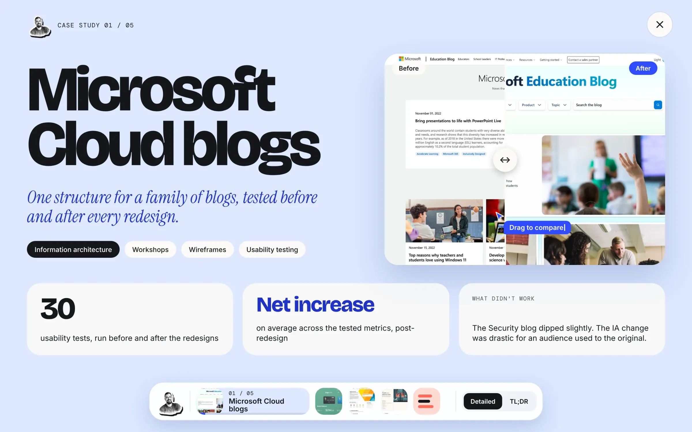
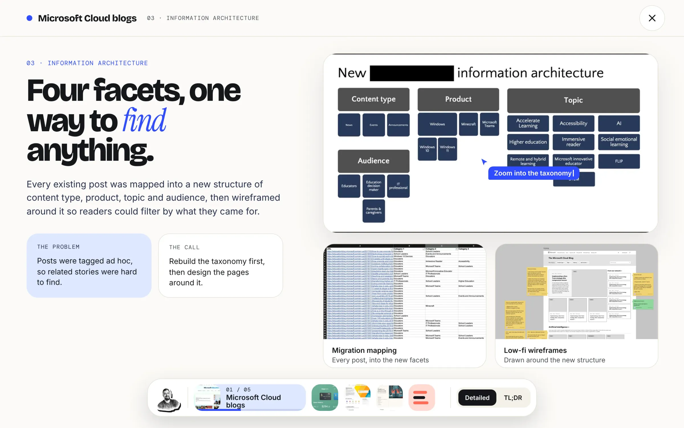
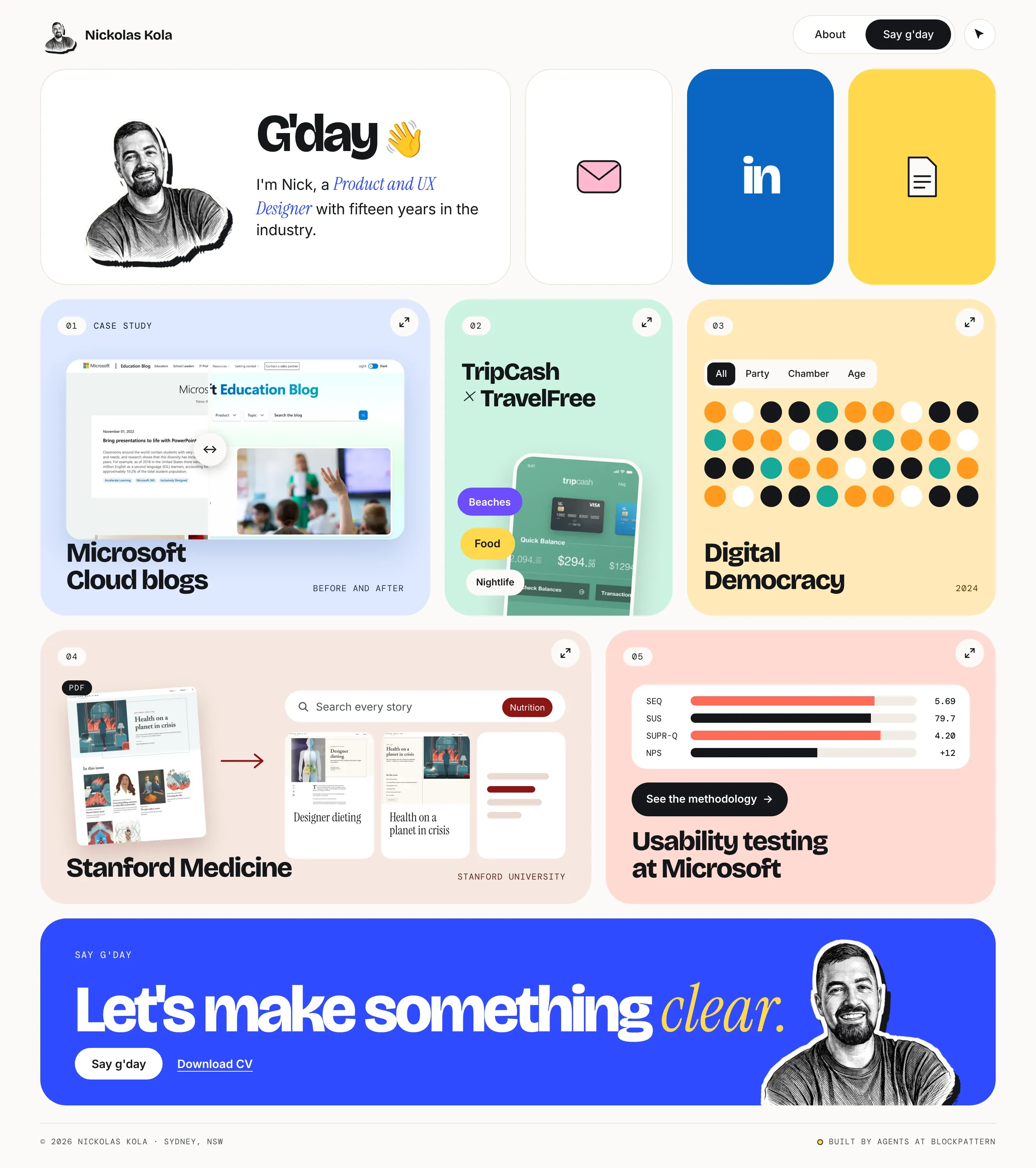
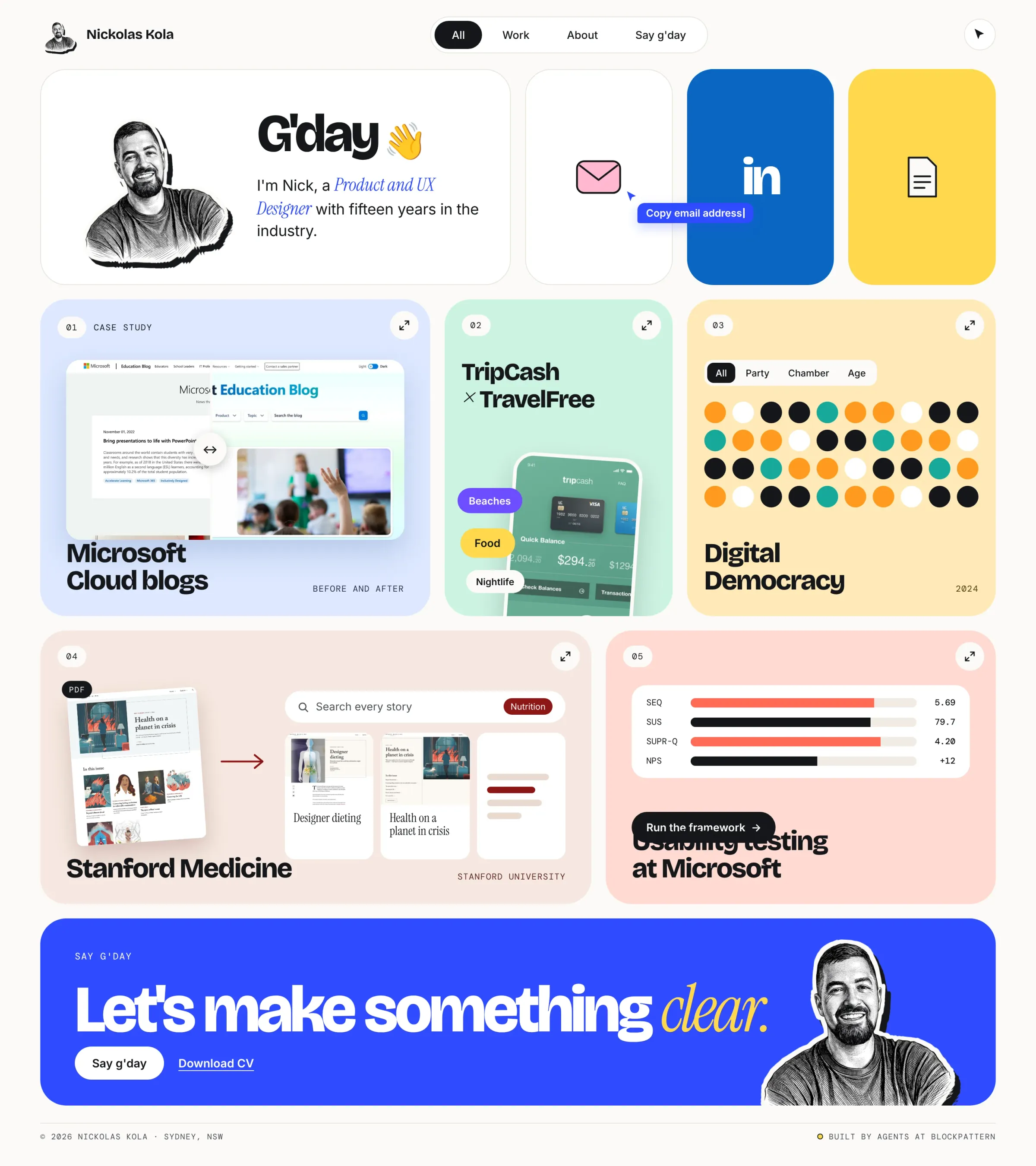
I designed every screen before any code was written, then my agents built from it. Drag across to compare the design with the live site.
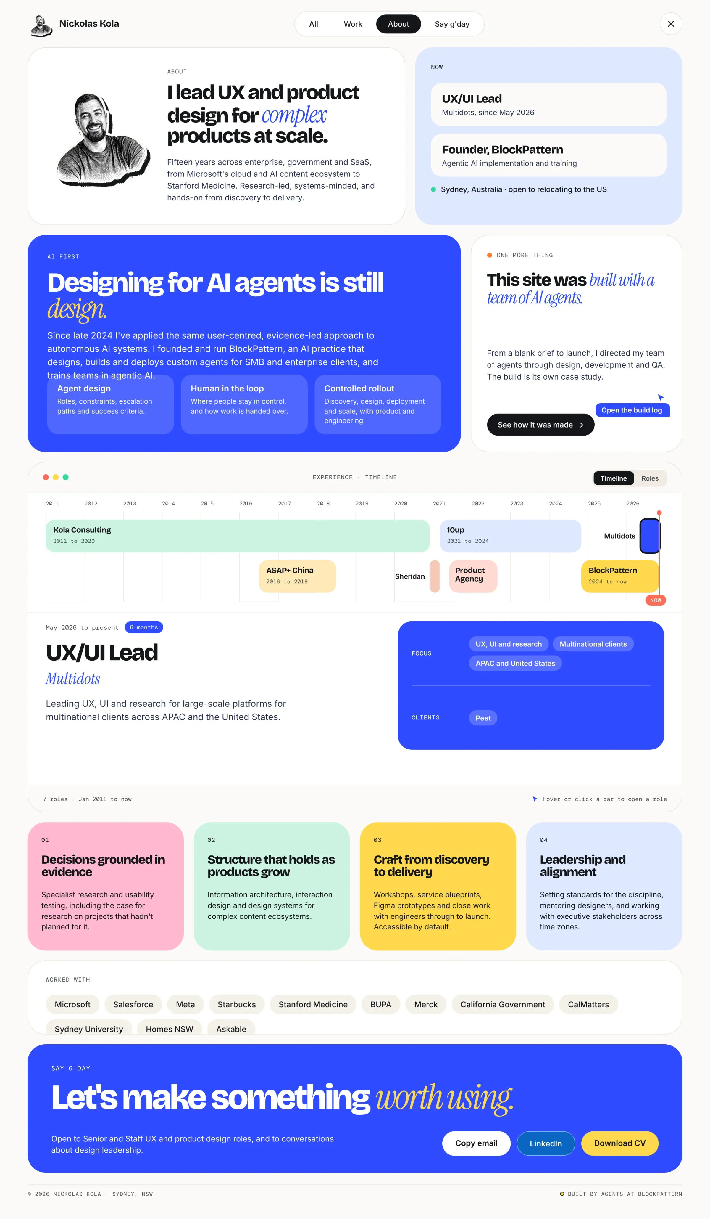
Not everything survived the first pass. The About page started out looking and reading like a plain web page, a bit like a CV. Productising the whole experience was important to me, so About had to follow the same patterns as everything else: Home as the launchpad, and a menu bar to navigate on every other page.
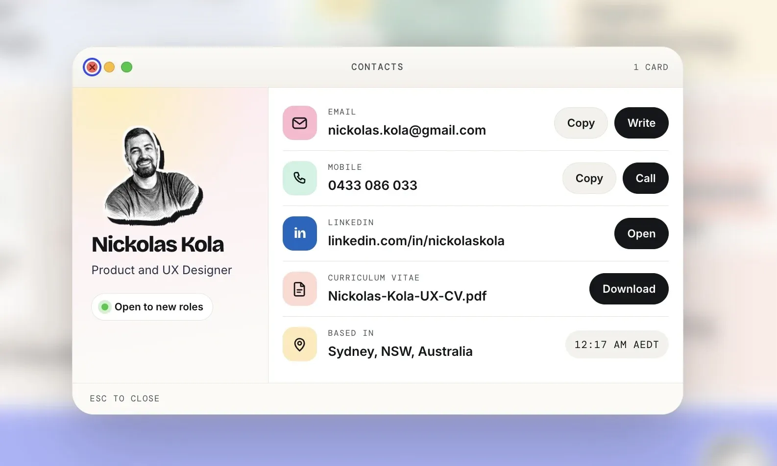
My agents' first pass also relied on mailto: links alone, with no contact window or page. I designed a macOS-style contact window and had it added.
Home · design and live
05 · The team
Directing a team of agents.
I treated my agents like any design and development team: periodic check-ins and milestone reviews to keep the project on task and on brief.
My job was design direction, writing the instructions, sourcing and creating the assets by hand, and being the key stakeholder who signed off each milestone.
An independent QA agent, one that hadn't written any of the code, tested the build against WCAG 2.2 AA with over 1,400 automated checks.
What I did
- Design direction
- Writing the instructions
- Sourcing and creating the assets
- Key stakeholder, signing off every milestone
What the agents did
- Built the pages in code
- Layout and image optimisation
- Drafted copy for me to rewrite and fact-check
- Tested it, with a QA agent that hadn't written it
06 · Where it's at
Proud of it, not finished.
This is an amazing piece of work for me, the culmination of 15 years of product experience and 3+ years of relentless agentic AI nerdery.
I'm not 100% happy with the case study layouts yet, and I'll be rolling out updates over the next few weeks.
I'm also not happy with how the GUI menu feels on the case study pages compared to the About page. That needs refinement too, and it's coming.
07 · The designs
Every screen, before the code.
Every screen I designed before a line of code was written, from the home concepts to the final pages. Open any of them to see it full length.
Home concepts 04
The chosen design 03

Case study pages 02